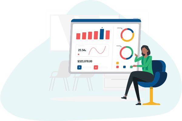
Data Visualisation
₹120,000
Total Fee₹10,000/month
EMI Starting
Why Choose This Program?
Real Dashboards & Reports: Design dashboards using real data from sales, marketing, and operations domains.
Tools That Get You Hired: Gain expertise in Tableau, Power BI, and Python/JS libraries used by top data teams.
Mentor-Led Guidance: Get weekly feedback, live reviews, and presentation tips from data visualisation experts.
Placement Support: Resume reviews, mock presentations, and help landing data visualisation and BI roles.
💰 Program Fee: ₹1,20,000 | EMI starts at ₹10,000/month
What Makes Us Unique?
| Features | Our Program | Traditional Courses | Free Tutorials |
| Live Dashboard Projects | ✅ Yes | ❌ Rare | ❌ No |
| Visual Storytelling Skills | ✅ Yes | ❌ Minimal | ❌ No |
| Placement Support | ✅ Yes | ✅ Yes | ❌ No |
| Payment Flexibility | ✅ Yes | ❌ Rare | ✅ Yes (Limited) |
How This Program Works
1. Real-World Module Development
Create charts, dashboards, and maps with real datasets
Design for clarity, context, and executive communication
Apply storytelling principles in business reports
Use filters, slicers, KPIs, and drilldowns
2. Projects to Build Your Portfolio
Sales dashboard in Power BI or Tableau
Marketing performance dashboard
Geo-visualisations with map overlays
Story-based visual presentation for stakeholders
3. Continuous Feedback & Improvement
Mentor feedback on UI, data selection, and narration
Weekly review of design choices and usability
Color, layout, and accessibility best practices
Practice presenting insights with real impact
4. Placement Preparation
Resume and GitHub portfolio with dashboards
Mock interviews and presentation rounds
Case study discussions and storytelling prompts
Hiring referrals and job connections
Who Is This Program For?
✅ Students & Analysts – Build job-ready visual communication and dashboard design skills.
✅ Business Professionals – Learn to present data clearly and influence decisions with compelling visuals.
✅ Career Switchers – Break into BI and analytics roles with hands-on visualisation projects.
Tools & Technologies You’ll Master
BI Tools
- Tableau
- Power BI
- Looker Studio
Visualisation Libraries
- Matplotlib
- Seaborn
- Plotly
- D3.js
Data Preparation
- Excel
- SQL
- Pandas
- Google Sheets
Presentation & Sharing
- PowerPoint
- Story Points
- Streamlit
- Google Data Studio
Program Timeline
Months 1–2: Visualisation Foundations
Understand visual grammar, chart types, and design best practices. Work with Excel and Google Sheets for simple data visuals.
Months 3–5: Tools & Dashboarding
Create dashboards using Tableau and Power BI. Use filters, slicers, and visual interactivity for decision-making support.
Months 6–7: Visual Narratives & Stories
Build story-driven dashboards using real-world scenarios. Apply design theory to improve communication clarity.
Months 8–9: Capstone & Career Support
Present your visual story, build a public portfolio, and prepare for data storytelling or BI roles with real case studies.
Career Outcomes
Get ready for roles like:
Data Visualisation Specialist
BI Developer
Reporting Analyst
Dashboard Designer
Why Data Visualisation?
Business Impact: Great visuals help leaders make faster, better decisions.
High Adoption: Tools like Tableau and Power BI are now core skills in BI and analytics teams.
Creative + Analytical: Combines design thinking with data—perfect for visually-inclined professionals.
Frequently Asked Questions (FAQs)
Apply Now
Ready to turn data into decisions?
Apply today and become a certified Data Visualisation Specialist in just 9 months with GullyAcademy.
👉 [Apply Now]
Contact & Pricing
💰 Total Fee: ₹1,20,000
📆 EMI: ₹10,000/month
📞 Call/WhatsApp: +91-8095858589
📧 Email: info@gullyacademy.com
Refund Policy
We offer a 100% refund if you withdraw within the first 2 weeks of the program—no questions asked.